Products
Each and every product listing will show the following details of product
- Product Image
- Discount Percentage/Amount
- Product Name
- Product Price
- Variant Section
- Add Button
- Wishlist button
Product Image
A product has the option of featuring either a single image or multiple images. In the case of multiple images, users can view them by clicking on the left and right arrows.
Customers can also zoom in on product images just by hovering their mouse over the image when they're on a desktop computer. It allows them to see the product details more clearly, which can help them make better buying decisions.
Service Request ID: PROD_IMG_ZOOM
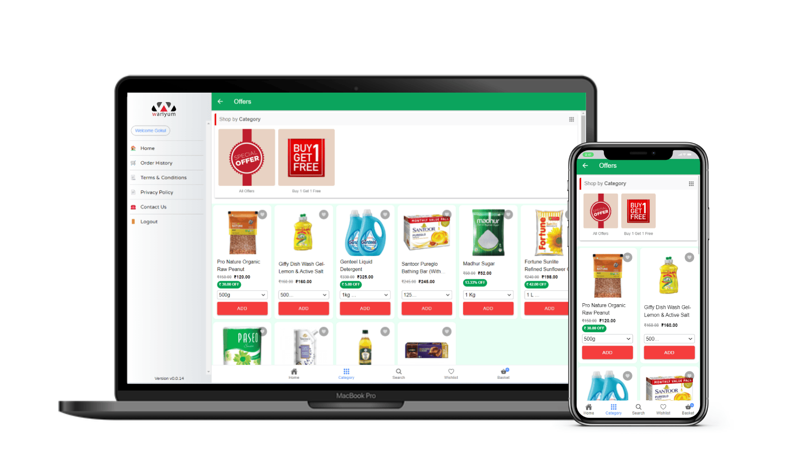
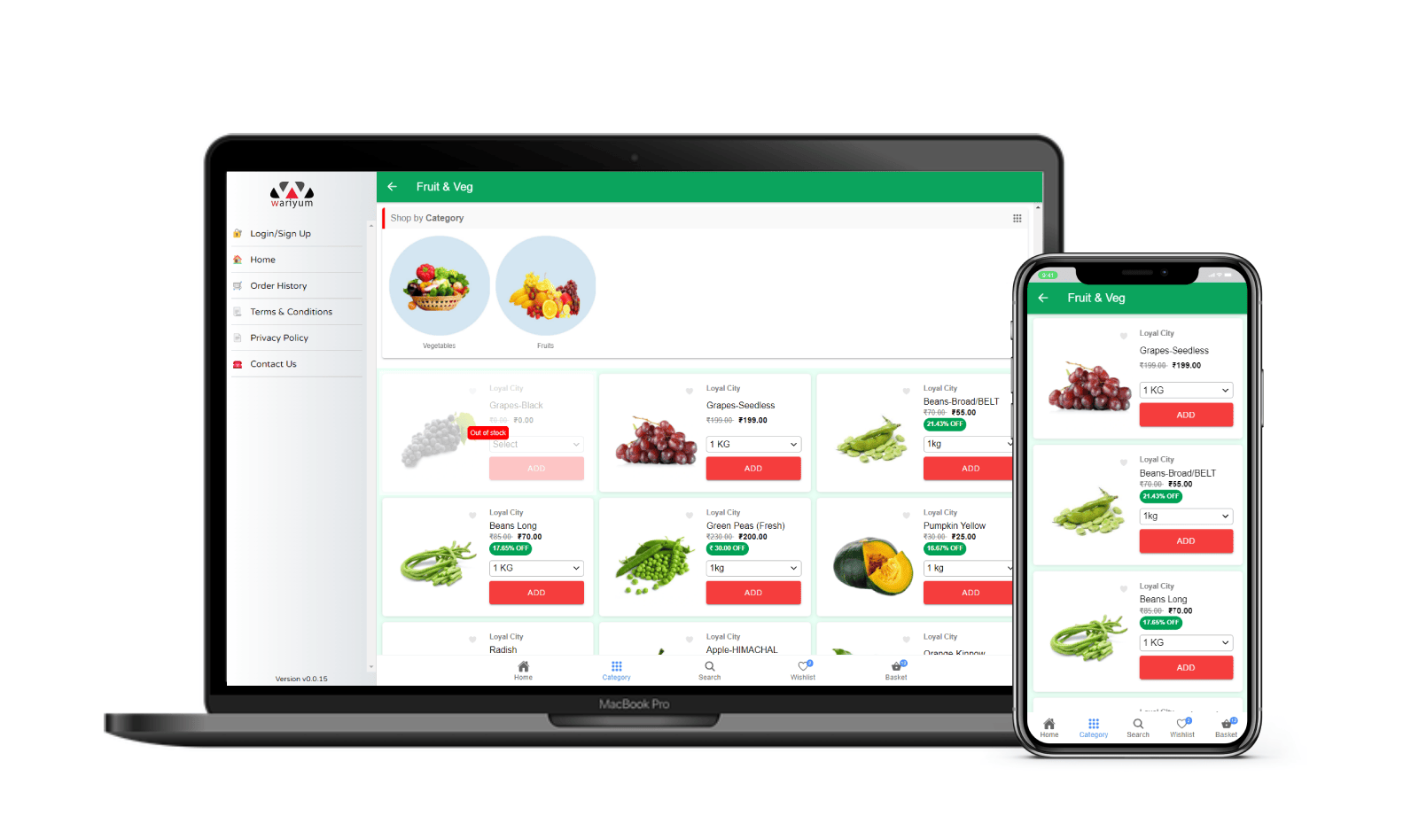
Product listings
There are various types of product listings available in the storefront.
Top selling products
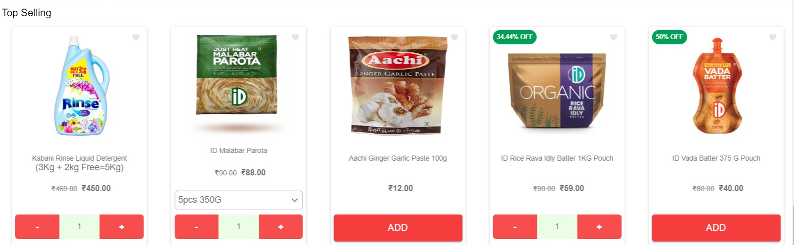
The Top Selling section allows store owners to select products to be featured. It is presented in a carousel style, allowing customers to scroll through products from left to right.
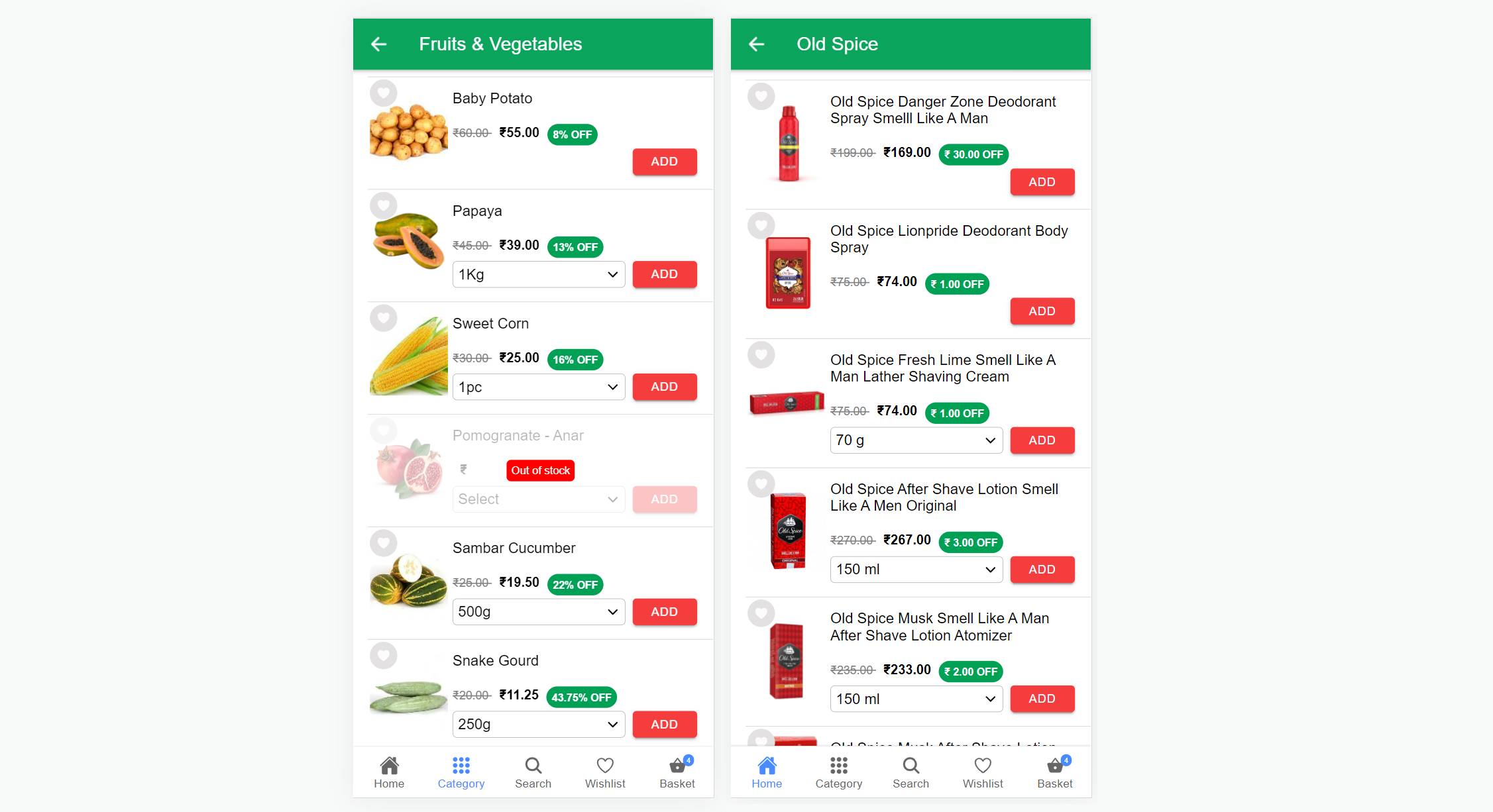
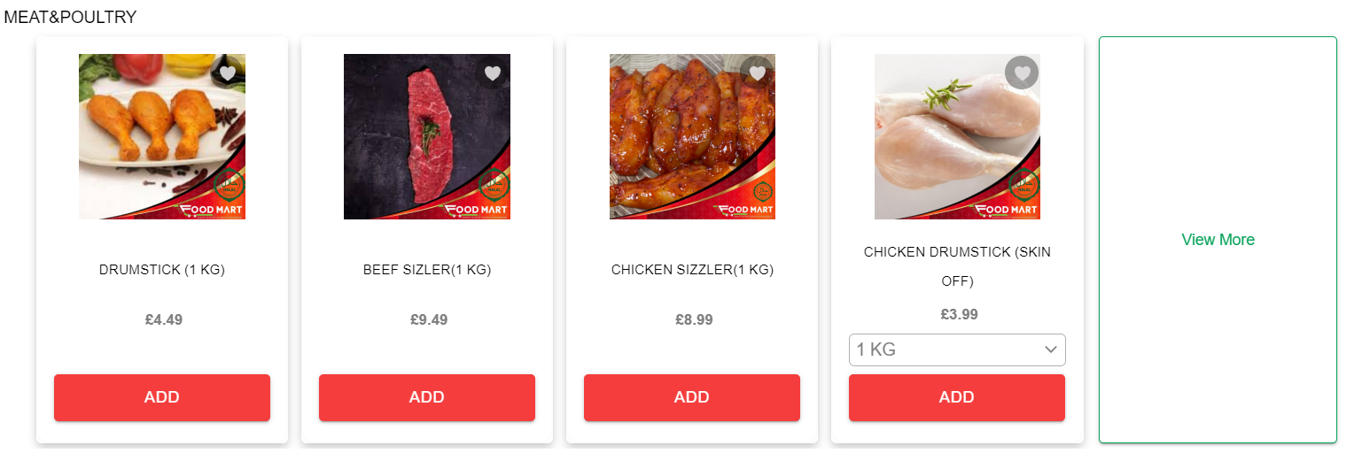
Category/Brand based products
This section is presented in a list style and includes all the basic product details.
Product Show Case
The product showcase feature highlights or presents selected products in a visually appealing and attention-grabbing manner.
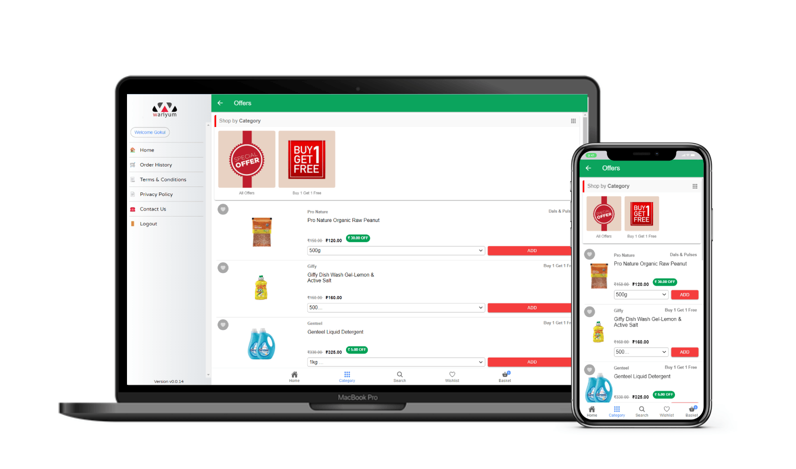
Search listing
The search listing displays products in the same way as the category and brand listings. It also includes a search bar at the top.
Listing Styles
There are three different product listing styles available
Style 1
This compact design is specifically optimized for mobile screens, displaying a minimum of 5 products per screen based on the device.
Style 2
The grid-style listing allows for more products to be accommodated on a single screen.
Style 3
This responsive design is compatible with both mobile and web platforms. On mobile, it displays products in a list view, accommodating 3 products per screen, while on the web, it shows 3 products in a row.
Style 4
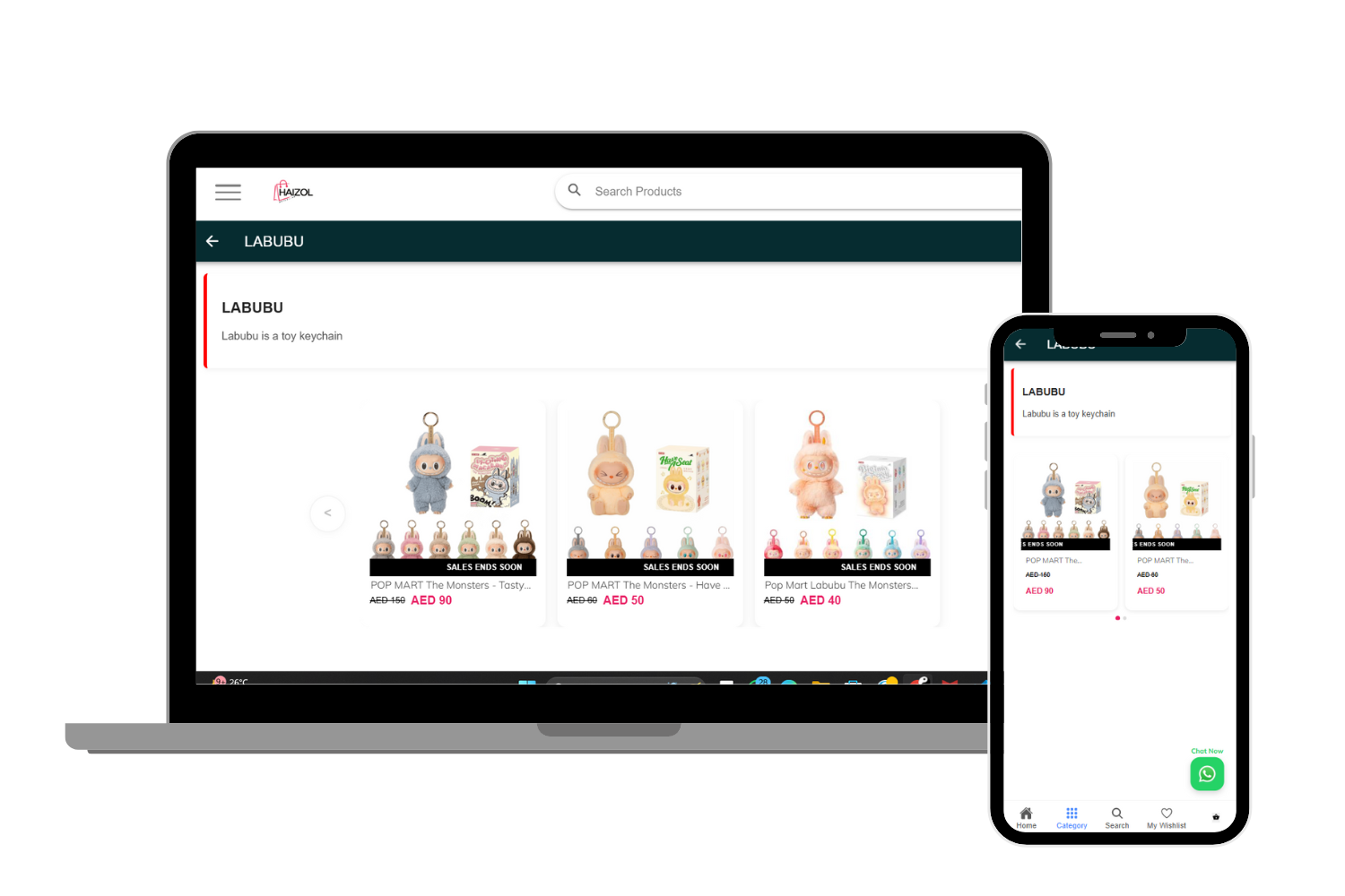
- Products appear as cards in a horizontal slider.
- Users can swipe or slide to view more items
- The tag like “SALES ENDS SOON” appears as a scrolling marquee over the product image
- Great for highlighting offers or limited-time products
- Fully responsive for mobile and desktop
Customizations
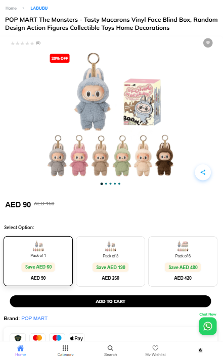
Product Name at the Top
-
At the very top of the page, customers can see:
- Category path like:
Home > LABUBU - Product name clearly shown below the category.
- Category path like:
-
This helps customers understand what they’re looking at and where they are in the store.
Product Rating on Top
-
Right below the product name, stars are shown for ratings.
-
It shows:
- Average star rating
- Number of customer reviews (if any)
-
This helps build trust with new buyers.
Tags
- These tags show important info like discounts or urgency.
- Example: “20% OFF” appears if the product is on sale.
- “Limited Stock” can show if the product is low in quantity.
- Tags can be set for specific categories.
Share Button
-
A small share icon is shown over the product images.
-
Clicking it lets customers share the product on:
- Or copy the link
-
Makes it easy for users to send product links to friends.
Product Variants with Images
- If the product has different styles, each option is shown with a picture.
- Example: Pack of 1, 3, or 6 – all with images and prices.
- Customers can tap a variant to see details and price change instantly.
WhatsApp Chat Support Icon��
- A green WhatsApp icon appears at the bottom right corner.
- When clicked, it opens a chat with the support team.
- Helps customers get quick help or ask questions.
Product Reviews
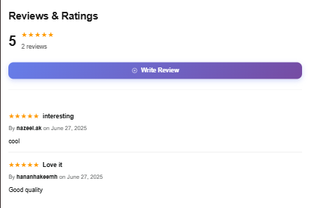
Who Can Write a Review?
- Only logged-in customers can write a review.
- If you're not logged in, the “Write Review” button won’t be visible.
Steps to Write a Review:
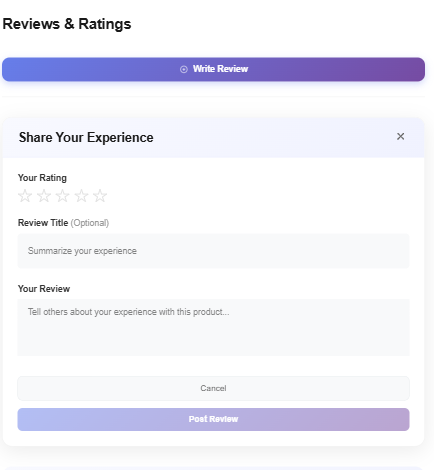
-
Click the “Write Review” button.
-
A box will open where you can:
- ⭐ Select a star rating (1 to 5 stars)
- 📝 (Optional) Add a title for your review Example: “Loved it!” or “Okay product”
- 💬 Type your review message Example: “The product quality is great and delivery was fast.”
-
Click “Post Review” to submit.