Banners
Overview
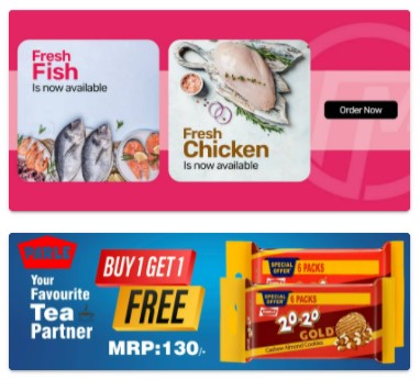
Banners are often used to highlight ongoing sales, discounts, or special offers to attract customers and encourage them to make purchases.
In our scenario, we have multiple slider spaces on the homepage. Each slider space can contain multiple images that automatically slide or transition at a predefined interval. These images are often used as banners to display offers, promotions, or important messages to customers.
When a customer clicks on a banner image, they are redirected to a specific location or webpage that has been set within the Navigator. This can be a landing page for a particular promotion, a product category page, or any other designated location relevant to the banner's content.
By utilizing sliders and clickable banners, it creates an engaging and visually appealing interface that effectively communicates offers and important information to the customers, while also providing convenient navigation to relevant sections on the Storefront.
Banner Resizing
Banner resizing refers to the process of adjusting the dimensions of a banner to fit different display sizes or layouts to ensure that banners appear correctly and aesthetically on various devices, such as desktop computers, laptops, tablets, and smartphones.
Key aspects of banner resizing include:
-
Responsive Design: Resizing banners is a fundamental aspect of responsive web design. It ensures that the content adapts to the screen size and orientation of the device, providing an optimal viewing experience for users.
-
Optimizing for Page Load: Resized banners optimize performance by compressing images to reduce file size while maintaining image quality, which contributes to faster page loading times.
-
Dynamic Resizing: In some cases, websites implement dynamic resizing, where banners are served based on the user's device or screen size. This ensures that the right-sized banner is displayed to each user.